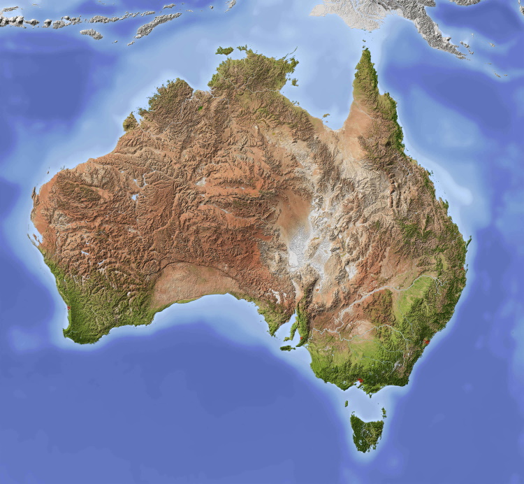

They have a draft map of suitable locations for wind turbines and then filled the map with shades of green. Where green, for some reason, is a location where your application is likely to be denied.
They are supposedly using red for sites that are “desirable” for wind turbines… supposedly because that’s just according to the key on the map. There is literally no red on the map that I can see.
Keep in mind most of NSW doesn’t even have any reliable wind at all - probably the grey area of the map. To me it sends a clear message NSW just isn’t planning to allow wind power at all. They are going to keep burning fossil fuel as long as they possibly can.

Which one of those would you rather live near? And why do they get held to different standards?
A lot of our coal power plants are just a hundred metres from suburbs full of homes. We also have rules that allow The coal plant below was across the highway from an entire town (thankfully, shut down and did so ahead of schedule because it was too expensive to be financially viable).
The smoke coming out of the coal power plants is known to be toxic and kills an estimated 8 million people per year globally. Australia allows coal plants to emit those toxins at 10x higher levels than other countries and we regularly fine coal power stations for exceeding the limits placed on them.
The second one is well within 2km (NSW’s new limit) of some farm houses which protested their construction, supposedly because they’d get cancer. There wouldn’t be many places in Australia that have suitable winds without being within 2km of a house. Realistically the only real potential problem is a power plant might fall over and land on a cow. One of them caught fire once… but all of the fire was at the top of the tower and it didn’t reach the ground. They do make a bit of noise, but less than, say, cars driving down a road.